PARK!T
UI/UX Mobile App

What is PARK!T?
PARK!T is a mobile app that aids in helping people find available parking spots nearby, prices and operating hours for garages, lots and street parking in your local area. Users are able to filter parking spots by location, payment type and much more. By partnering up with airports, stadiums, and more, Park!t lets you to plan your route for upcoming events so that you can find a spot close to the action without having to waste time searching for a parking spot. Park!t lets you pay as you go or you can reserve a spot in advance as long as it’s available!
We’ll find it, you Park!t

RESPONSIBILITIES
User & Market Research, Wireframe & Layout, UI/UX Designer, Usability Testing
PROGRAMS USED
Adobe Illustrator, Adobe XD, Figma
CONTRIBUTOR
Jodie Tu
TIME FRAME
4 weeks
01 - Project Background
PROBLEM STATEMENT
Frustrated drivers need a way to be able to locate available parking during peak hours to reduce the amount of time spent in parking lots trying to find a parking spot that often causes them to be late.
OBJECTIVE
PARK!T aims to provide drivers with the simple solution of way-finding available parking spots by promoting mobility and efficiency. The intention is to reduce the stress that drivers encounter when trying to find parking during peak hours. Finding local and global parking locations becomes easier when users can create personalized list of most frequent places.
AUDIENCE
The target audience, although open to people of driving age, is mostly attributed for those who are able to drive and have access to a vehicle. The style of the mobile app is intended to be simple and fun through the bright colours to reduce the stress of finding parking.
02 - Branding & Identity
The name PARK!T (sounds like ‘park it’) is intended to be what it sounds like. As the mobile app works behind the scenes to help drivers locate parking space ('“We’ll find it,”), users have one job and that is to ‘park it!’. The logo of PARK!T is a combination of the letter ‘P’ and the location symbol. Since the mobile app is to help people find parking locations, it seemed fitting to combine those two elements together. The rounded elements of the logo allows the company to be perceived as ‘playful’, ‘fun’ and stress-free rather than being corporate and formal. This has also influenced the typefaces that were chosen for the brand of the business.
TYPEFACE
The two typefaces chosen are Museo Sans Rounded 900 and Cooper Hewitt Book and Italics. Museo Sans Rounded 900 is used mostly in headings and the company’s name, PARK!T. The secondary font is Cooper Hewitt Book which is used for the content information within the mobile app, whereas Cooper Hewitt Book Italics is used to emphasize words or within the app, an example would be the app name ‘PARK!T’ within the tagline.
COLOUR
The colour palette chosen for the PARK!T mobile app is a quad that consists of a teal-blue (#009CB1) which is the app’s main colour, navy-blue (#25324D), a dark-grey (#555555) and orange (#F58020) as a complementary colour that creates contrast with the teal-blue. The colours teal-blue and navy-blue were chosen as the two main colours of the business is because blue is a colour that often conveys trust and dependability that will help in creating customer loyalty. The blue indicates reliability and with PARK!T, drivers can rely on us to find a good parking spot at a good price. The colours dark-grey and orange acts as supporting colours, grey mostly being for text and information and orange creates the visual contrast to highlight or emphasize certain features within the mobile app.

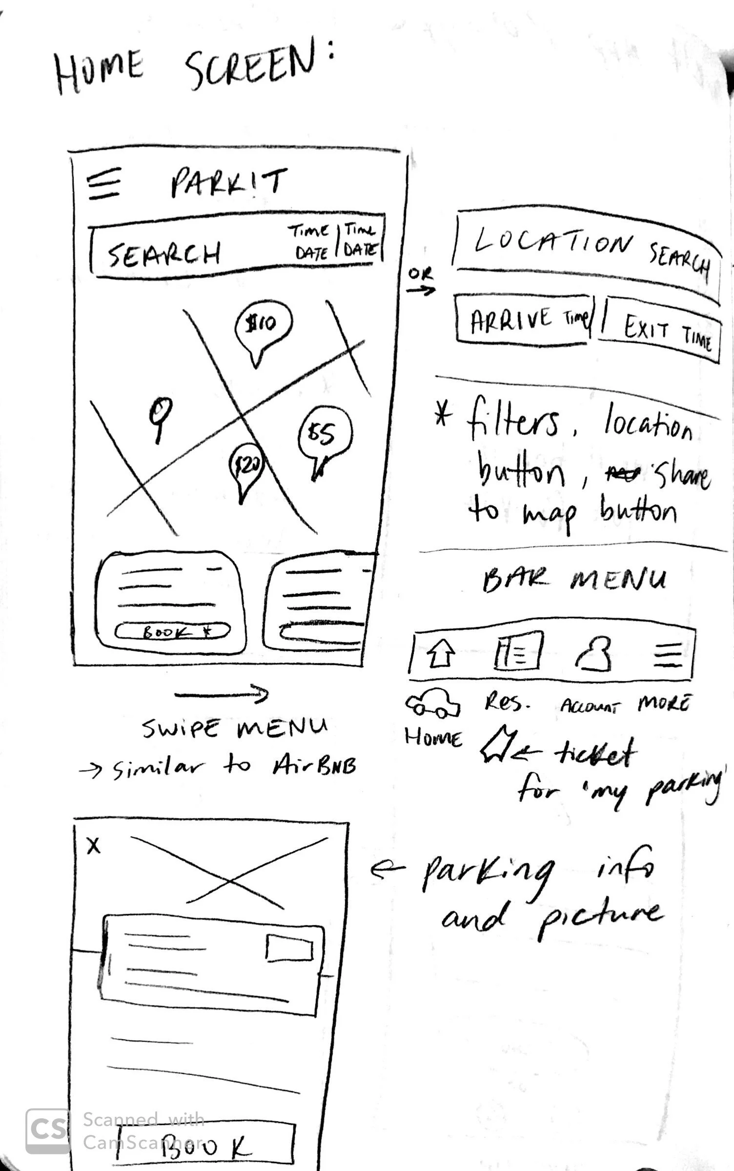
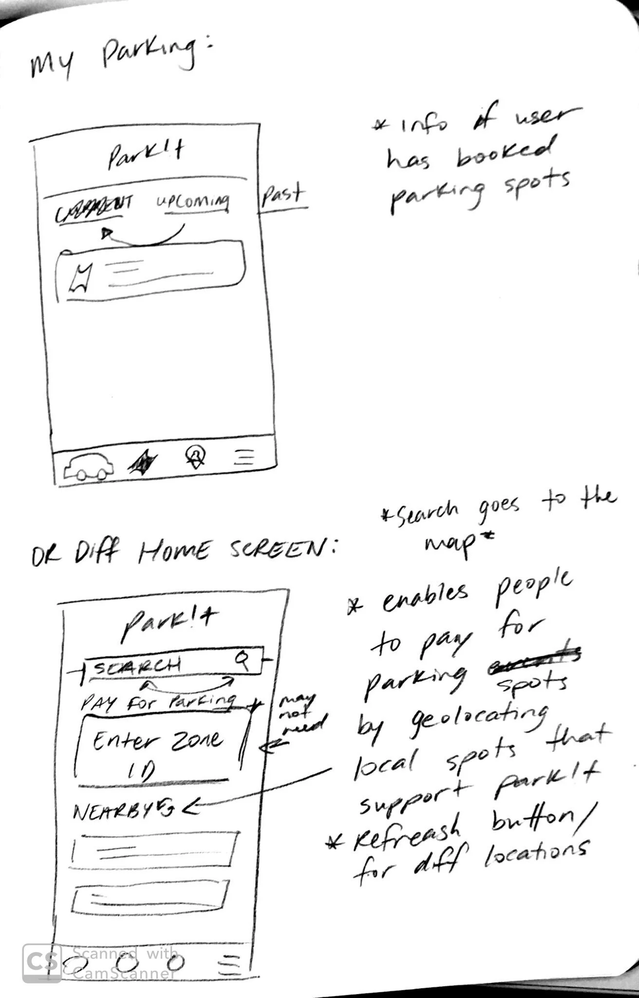
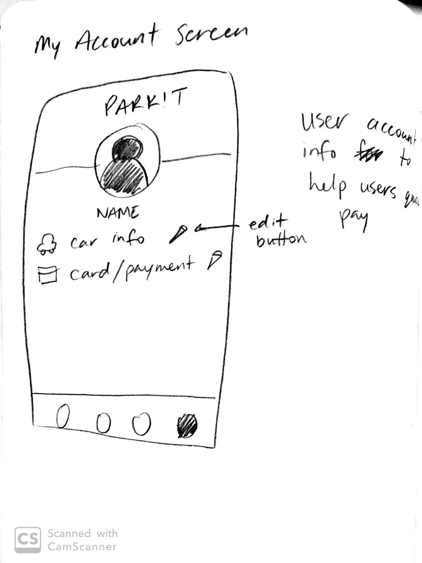
03 - Wireframes

06 - Takeaway
This was one of my first big projects that was completed for both my Interaction Design and Visual Design courses at Conestoga College. In Visual Design, I learned how to create, develop and establish an effective brand from colour theory, typography and other design elements that allowed me to successfully design a brand for Park!t. Interaction Design, allowed me to work with prototyping programs such as Figma, InVision, and Adobe XD and learned how to create user interactions and make my prototype a working MVP. The one thing that I would say I am most proud of was the ability to create a free-scrolling map for my mobile app that worked successfully in letting users get an idea of how the app works.
I was able to use the knowledge that I have learned from other UX classes to conduct user research and testing for the mobile app to better enhance the experience users have with the prototype. Not to say that this is the finished product, knowing that there are a lot more to work out within the mobile prototype of Park!t. I was able to apply concepts and techniques from other courses to complete this project. I gained a deeper understanding of the workflow, through working with the design thinking process that UX designers go through to iterate and create a product.


